
What a course website template should do (and what it shouldn’t)
Choose a course website template with a CMS syllabus, clear enrollment, and the membership setup you need. See how Cohestra integrates FrameAuth in Framer.

Every course platform gives you a page. Kajabi, Teachable, Skool, Maven, they all hand you a storefront, and they all look like what they are: a rented page on someone else’s platform, one template away from every other course in your niche.
A separate course website gives you control over how you present the curriculum, instructor, and student outcomes. You can keep delivery on a course platform or add membership to your Framer site through an integration such as FrameAuth.
Choose that setup deliberately. Check which service handles authentication, access, payments, and lesson delivery, what it costs, and how you would move your content later. Webflow’s decision to retired its native User Accounts is a reason to understand those dependencies before launch.
Three things to judge a template on
1. The catalog lives in the CMS
Courses, lessons, and outcomes should be data, so a syllabus is rows in a table instead of a layout you rebuild per course. A single-course creator and a five-course academy should be the same template with different content.
2. The course detail page does the selling
Judge this page hardest. It needs room for the curriculum, the instructor, real student outcomes, and an enrollment card that stays in reach while someone scrolls a long syllabus. This is the page a flagship cohort lives or dies on, and most templates treat it as an afterthought.

3. Enrollment fits the way you sell
If you already use Kajabi, Maven, or another course platform, the enroll button should link to that checkout. If you want members to sign in and access content on your Framer site, look for a prepared membership integration. Check the subscription, payment-provider fees, and setup requirements before choosing.
How Cohestra handles this
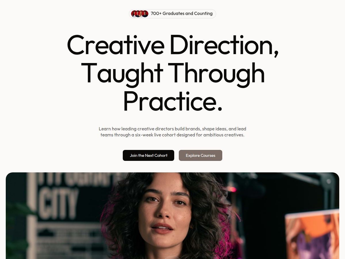
We built Cohestra for course creators and creator-led academies. It now includes sixteen responsive pages: a course index, course details with syllabus tables, pricing, journal, webinar, lead capture, and four auth pages. Four CMS collections hold courses, lessons, articles, and outcomes. FrameAuth membership is integrated, with sign-up, sign-in, account pages, and ready overrides for gating content, bookmarks, and lesson completion. You can accept payments through FrameAuth or keep enroll buttons linked to your existing course platform. FrameAuth requires a separate subscription, with a free trial available; hosted video is not included. See the live preview, or get the template for $99 as a one-time purchase. Check the current Startfrom license for Single Site, bundle, and all-access terms. Orders placed before September 3, 2026 keep the terms they were sold under.
Whichever template you pick, the fastest way to make it yours is an AI agent working inside Framer’s structure: copy, colors, typography, images, and SEO in a couple of hours. The workflow is in the free AI customization guide.