Guide
·
Aug 27, 2026
What an app landing page actually needs
The paid click, the creator link, and the press mention all land on one page with one job: move a visitor to one button. Three checks that tell you whether a landing template is built for that job.

Written by

By the time someone reaches your app’s landing page, they have usually already seen the app. The store listing showed them screenshots, the ad showed them the pitch, a friend showed them the icon. The landing page is where the paid click, the creator link, and the press mention all land, and its job is narrow: hold attention for ninety seconds and move one person to one button.
That narrowness is the standard to judge a template by. Not how much it ships, but whether the one page that matters is built in the right order, and whether everything around it earns its place.
Three things an app landing page actually needs
1. The page carries the whole decision, in order
Hero with the product in hand, how it works in a few steps, numbers that prove people stay, real users saying so, and answers to the questions that block a download. In that order, on one page, so a visitor who never clicks anything still gets the full argument. A landing page that leans on navigation to finish its story loses the majority who never touch the nav.
2. Pricing lives one click away, not mid-scroll
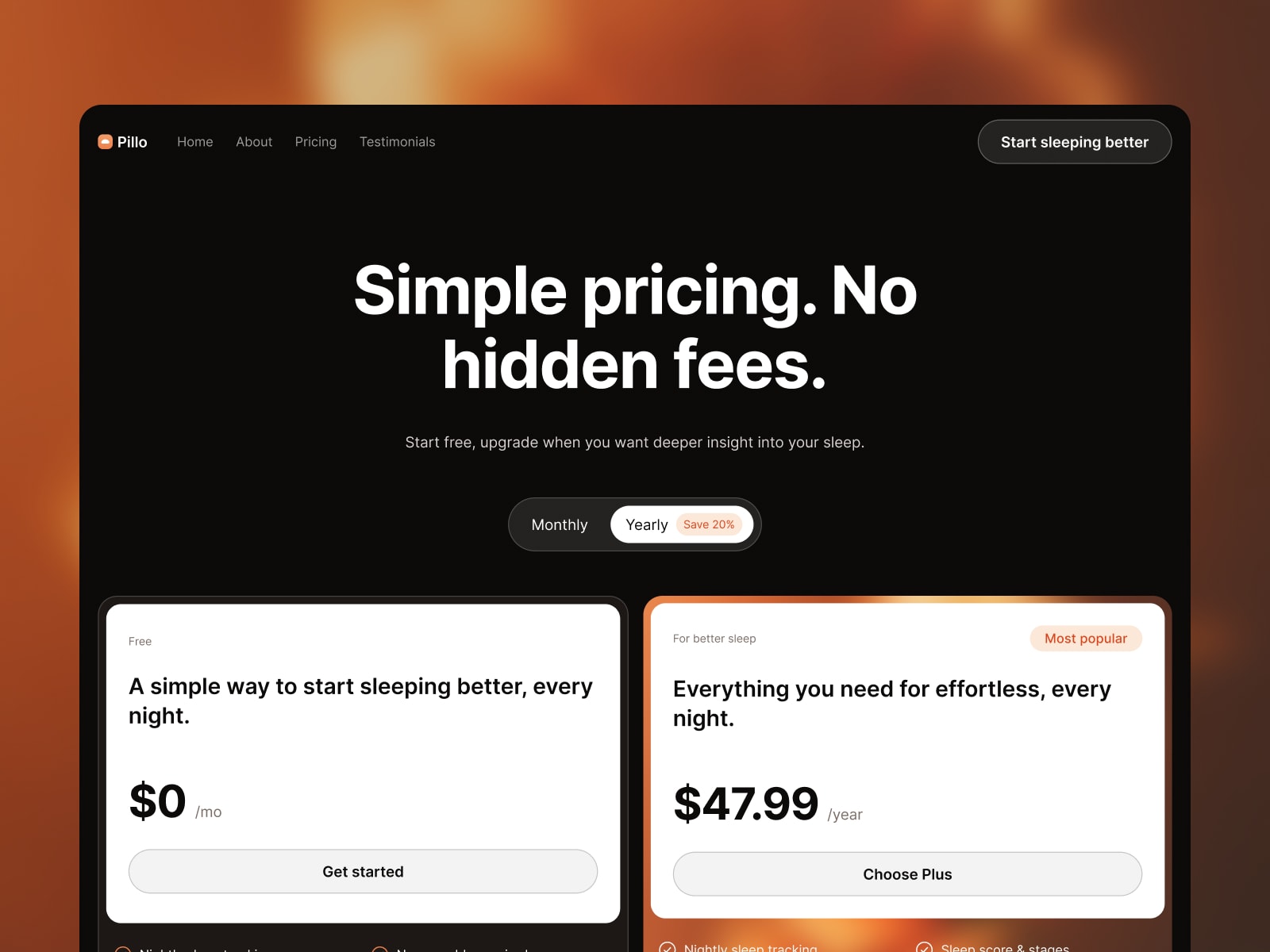
Plan comparison interrupts a story. Keeping it off the landing page keeps the narrative clean, and a separate pricing page gives ads and App Store outlinks a direct destination for people who only want the number. That is the one page that earns its place next to the landing page itself.
3. No CMS you will never fill
CMS collections in a landing template mean a higher Framer plan and empty sections shaped like obligations. A landing page’s content changes at product milestones, not on a publishing schedule, so static pages are a feature here: cheaper to host, faster to edit, nothing to migrate later. Choose a template whose plumbing matches the site you are actually launching.
How Pillo handles this
We built Pillo around exactly that shape: a landing page and a pricing page, finished. A warm, cinematic landing page where a device mockup carries the product: hero, three-step how it works, a metrics band, testimonials built separately for desktop and phone reading, FAQ, and a final call to action. Pricing lives one click away with a split zoom transition and free and paid plan cards. Light and dark themes ship out of the box with a one-tap toggle, every color and text style is tokenized, and there is no CMS to pay for. The demo brand is a sleep tracker, but the structure fits any consumer app with a story to tell.
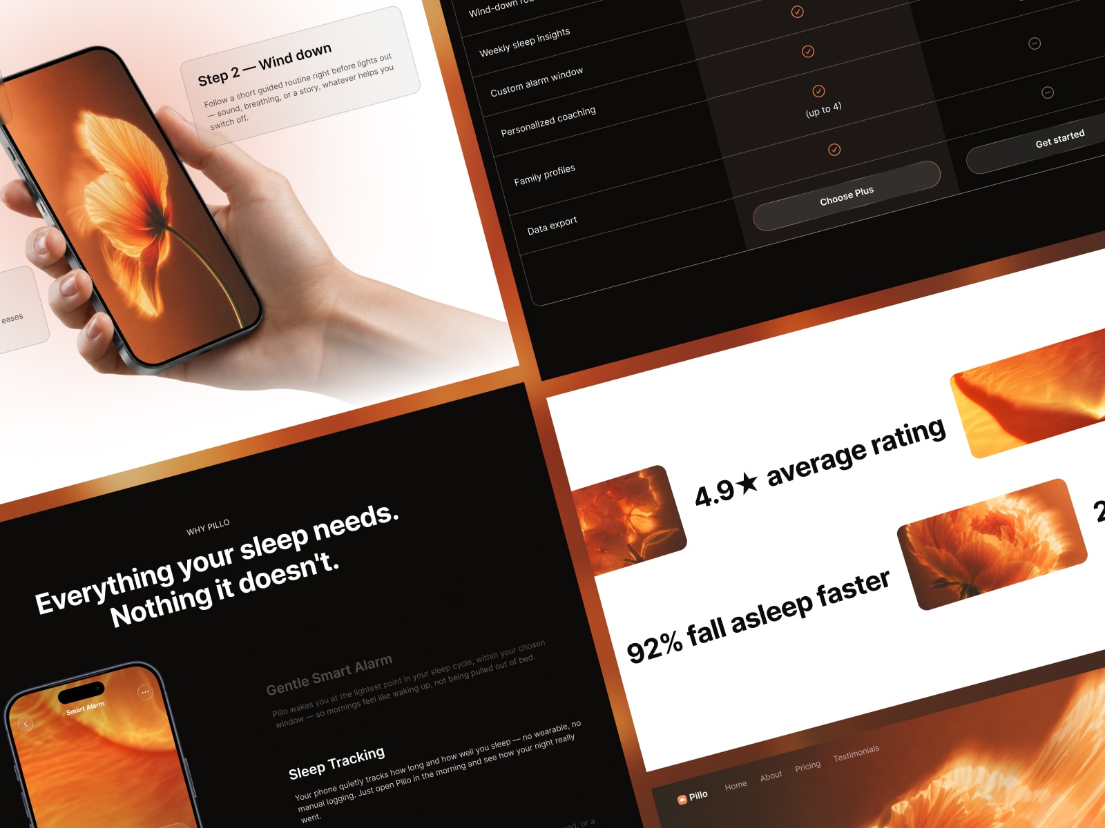
There is a live preview, and it costs $49 for the Framer template, or $79 with the Figma file. Current Startfrom purchases use the Single Site license for one website; all-access plans have broader rights. Orders placed before September 3, 2026 keep the terms they were sold under.
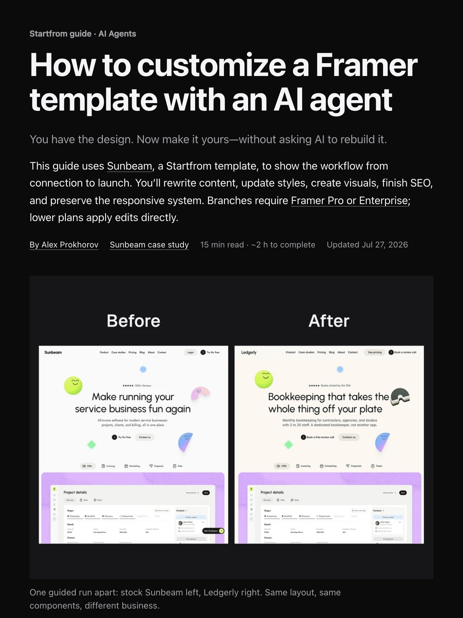
Whichever template you pick, the fastest way to make it yours is an AI agent working inside Framer’s structure: copy, colors, typography, images, and SEO in a couple of hours. The workflow is in the free AI customization guide.